Color is an integral part of the human experience. Since the dawn of time, hues have held symbolic meaning and evoked visceral reactions across cultures. Red makes our hearts race, blue calms our minds—and every shade in between carries its own connotations that speak to our innermost beings.
When it comes to representations of strength, certain colors have maintained solid associations over centuries and civilizations. The vibrant intensity of a bold crimson, the radiating warmth of a bright golden yellow, the nobility of a rich purple—these pigments convey qualities like courage, confidence, authority and passion. They grab attention, incite action, and visually communicate messages of fortitude.
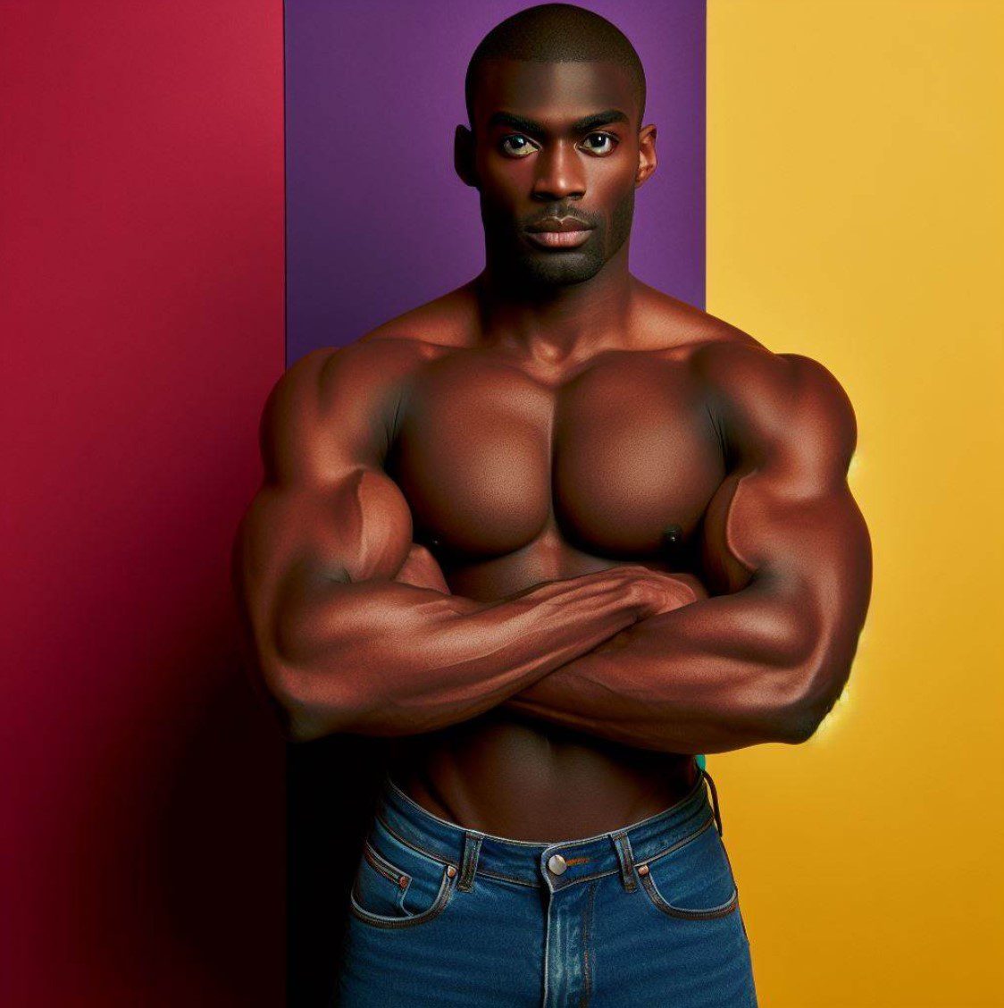
color-that-represent-strength-and-power
Also check out: 7 Colors that Represent Family (The Symbolism and Meaning to our Life)
This guide will explore the key colors connected to strength, from the most timeless classics to modern interpretations. We’ll uncover the historical origins of these associations, as well as the psychological and biological factors underpinning them. You’ll also find practical applications for leveraging color symbolism, with tips for integrating meaningful hues into designs, branding, events and beyond.
So let’s dive into this dynamic intersection of color science, cultural anthropology and good old-fashioned symbolism!
Table of Contents
The Classic Colors Representing Strength
Certain colors have become iconic embodiments of strength and power across cultures and eras. These classic shades have maintained largely consistent symbolic connotations over centuries—and in some cases, millennia.
Let’s explore the core colors denoting strength throughout history, what specific qualities they signify and why these associations developed.
Red Means Confidence, Passion and Valor
No color conveys sheer power quite like red. It represents primal life forces: the pulsing flow of blood, the dancing flames of fire, the blazing heat of the sun.
Across cultures, red symbolism has centered around war, valor, passion, lust and danger. In ancient China and Japan, red was strictly reserved for the nobles and royals who wielded control, while ancient Slavs used red body paint in battle to intimidate enemies.
This is because red triggers our strongest psychological and biological reactions. Extensive studies have shown red boosts metabolism, respiration, blood pressure and even appetite—essentially revving us up. It also enhances our attraction, perceived dominance, and perceived threat from others.
Today, this vibrant crimson shade remains an iconic emblem of power and confidence. From the red of superhero costumes to “power ties”, red clothes or accents convey leadership ability and influence in professional contexts. Using red is an easy way to underline ambition and drive—key aspects of personal strength.
Purple Commands Dominion and Prestige
The color purple has an illustrious history interwoven with riches, nobility, spirituality and mystery. For centuries, royal figures from Roman emperors to Japanese royalty donned the rich shade as a status symbol. As purple dyes were painstaking to produce and quite expensive, only the wealthiest elites could afford to flaunt them—denoting both material wealth and social station.
Meanwhile, purple played an important spiritual role in multiple early religions. It came to symbolize the Crown Chakra in Hinduism, representing powerful higher consciousness. Early Catholic leaders wore purple vestments, embroidering them with golden symbols of dominion and authority.
So from vast kingdoms to the realms of the divine, purple has commanded awe, deference and respect across societies. It continues to signify prestige and influence in modern times, especially in combination with gold accents. Deep purple tones also inspire introspection and greater purpose—aspects of strength that extend beyond worldly esteem.
Blue Represents Stability and Reliability
Blue is a cool, calming shade quite contrary to intense red and luxurious purple. However, its tranquil dependability has gradually evolved into representations of duty, loyalty and resilience over time.
While blue has earlier connections to spirituality and protection, its modern associations with stability took root during the Middle Ages. Highly regulated guild workshops in towns like Coventry exclusively produced blue dyes that met strict quality control. The phrase “true blue” emerged in reference to these steadfast dyes, eventually growing to connote reliability.
Further cementing connections to duty and resolve, blue military uniforms and symbols gravitated toward public service institutions over time, like the police. Stylized versions of these uniforms served as patriotic symbols expressing unwavering solidarity during wartime propaganda efforts.
So while blue avoids aggression and hot-blooded passion, it conveys a grounded strength of commitment and dependability. As blue shades grow darker, visual cues of depth and heritage amplify an aura of time-tested resilience.
Warm Color Psychology and Strength
Beyond the classic color trifecta of red, purple and blue — warm hues maintain close ties to vitality, confidence and courage on the battlefield and beyond. Let’s analyze how shades of yellow, orange and red derive symbolic connotations of strength from natural associations and cultural history.
Yellow Inspires Fresh Perspectives
Bright golden yellow first calls to mind the radiating heat and light emanating from the sun itself. As the majority of Earth’s energy derives from the glowing star at our solar system’s center, yellow captures a facet of the sun’s raw power.
By reflecting warmth into our planet’s ecosystems, yellow enables growth, productivity and renewal across habitats. It shares similar connotations of fresh perspectives and mental acuity in human psychology.
Studies indicate yellow activates left-brain logical thinking while boosting awareness, interest and attentiveness. Subjects exposed to yellow color schemes display heightened mental focus overall. The vibrant shade also widely signifies caution and warning, creating an implicit sense of danger or threat.
So while yellow avoids red’s ferocity, it maintains an energetic urgency that keeps observers engaged and alert. This is crucial in high-stakes situations requiring quick judgment. Consider the iconic yellow of emergency services equipment, life vests and hazard symbols — we recognize on a primal level that yellow commands attention when it appears unexpectedly.
Orange Calls Us to Action
Sharing aspects of both confidence-boosting yellow and passionate red — orange holds a special place between excitement and intensity. Often dubbed a “happy” color, vibrant orange evokes enthusiasm, determination and vitality on many levels.
In nature, shades of orange most famously characterize fast-moving objects associated with threat — like fire or tigers. Yet they also appear joyfully on flowers, birds, butterflies and marine life as visual cues for sustenance and reproduction.
Bringing movement and positivity together, orange takes action with gusto. Rather than threatening observers to engage like red, it playfully leaps into new endeavors. Orange conveys forward momentum, sparking interest and participation.
Consider how orange appears from traffic cones guiding cars to construction signage urging caution. Orange gets you to slow down, take notice, and change course — an achievement of gentle influential strength.
Red Means Confidence, Passion and Valor
Last but not least, red encapsulates every facet of strength and power across psychological, biological and cultural vectors. As the foundational shade from which orange branches and yellow highlights, red is radically unveiled strength unfiltered.
On a visual processing level, red immediately grabs attention as our minds are uniquely sensitive to its high-contrast vibrancy. Red light has the longest wavelength within the color spectrum, making it “first among equals” according to 11th century Persian scholar Al-Biruni. It was considered a symbol of leadership and authority across many early societies and religions.
Red also triggers our deepest instincts — quickening breath, accelerating heart rates and boosting adrenaline. Humans instinctively react to red much like prey species respond to warning calls, perceiving innate danger or competition. Yet red also facilitates attraction and interest between potential mates as our faces flush during courtship rituals.
These arousal effects give red an air of desirability and reverence. Add cultural associations with war, valor, passion and lust — red inspires awe and demands respect. It empowers those who employ it with an immediate visual platform from which to convey their drive and values at a glance.
Cool Colors and Mental Strength
While vibrant warm pigments capture attention with intensity — cool colors make subtler yet still significant impacts representing collected stability. Shades of blue, green and related hues build connotations of duty, resilience and wisdom over time through natural connections.
Let’s uncover how cool shades lend themselves to conveying mental strength with grace.
Green Facilitates Renewal and Endurance
Verdant green is intrinsically tied to thriving vegetation across habitats, symbolizing cycles of planting, growth and rejuvenation. Representing resilience through renewal, plants bounce back after difficult seasons to bloom with vitality again and again.
This regenerative aspect of nature translates as restorative mental strength in green color psychology. The cool shade calms hot-blooded reactions, helping minds endure stressors through introspective stillness and forgiveness. Green spaces heal trauma, clear toxicity, and balance emotions.
Over time, green’s restorative impact has expanded into signaling safety — the assurance of basic needs being met thanks to natural provisions. Green elicits stability and comfort, enabling cooler heads to prevail when pressure mounts. Consider how institutions leverage green to convey reliability — hospitals integrate green accents to inspire patient confidence during vulnerable experiences.
So while green avoids red intensity, it promotes mental wellbeing that strengthens focus and elevates perspective. Pausing within verdant hues grants clarity from meditative big-picture views — just what pioneers, leaders and gurus need to shepherd those in their care.
Blue Inspires Trust and Loyalty
Sharing symbolism with expansive skies and oceans — blue inspires a sense of poise and faith in one’s capabilities that builds loyal support systems. Dependable blue won’t let you down even on stormy days — sticking steadfastly to its assigned course like clockwork.
Its origins as a precious rarity in medieval times cemented noble implications. Rich blue pigments were complex to produce and strictly monitored for quality control. Only the finest textiles boasted saturated blue hues that didn’t easily fade or run. Loyal royal courts proudly wore Coventry blue while common folk could only adorn simple light blue apparel.
Over time, blue transformed into a staple shade for infrastructure and governing bodies associated with order and security — most iconically police and patriotic motifs. Sky blue uplifted national morale as a collective display of solidarity during wartime uncertainty. Navy and azure amplified gravity and purpose within officials’ uniforms.
So while blue avoids domineering displays of power, its heritage of structure and resilience provides a pillar of support. Clear sight, sincerity and steadiness in the face of adversity demonstrate understated strength.
Purple Commands Mystic Insight and Vision
Lastly, purple gleans wisdom from spiritual rituals and psychic mediums. Known as the “third eye” in mysticism, purple’s inherent rarity provides glimpses into realms beyond mundane understanding. Reserving purple vestments and garb for religious leaders preceded blue’s noble heritage.
In Hinduism, purple connects to the crown chakra, conveying sacred mastery of cosmic consciousness and supreme oneness with creation. Early Catholic bishops announced getaways into religious calendar observance wearing purple robes as they retreated into spiritual reflection.
Psychics maintain purple auras signal supernatural capabilities and invisible guides. Figures seeking sublime truth dwell in violet hues indicating supernatural talents detecting patterns and possibilities in the universe’s grand design. Purple’s otherworldly energy transcends earthly outputs of strength, achieving gnosis untethered from physical judges.
So while most blues strive for practical stability, purple follows flights of ethereal fancy. Its cool grace balances intense red; subdued compared to orange extremes — purple Billows gently like campfire smoke delivering insights. Although subtle, it profoundly empowers those who wield its mysteries.
Modern Color Representations of Strength
While ancient civilizations converged on core colors denoting power for war, sex and status — modern societies recognize strength’s diverse dimensions with an expanded palette. Contemporary cultures acknowledge more varieties of courage and character — encoding admirable traits within corresponding hues.
Let’s review noteworthy shades that have joined the pantheon of “power colors” in recent eras, what distinct qualities they signify and why they resonated with changing values.
Silver Signals High-Tech Futurism
As civilizations left agricultural ages and embraced industry — traditional gold metals granted way to steel and chrome. Silver metals literally built emerging urban machine eras, forging stronger and lighter alloys for rockets and vehicles to push capabilities further.
By visual association, metallic silver took on connotations of technological innovation,ingenious design and manmade wonder eclipsing nature. Silver age science fiction centered on utopian abundance, automation and spacefaring enabled by mental brute force strength.
The Jetsons epitomized silver era optimism with high-tech homes. Sleek silver appliances, electronics and accents represented humankind harnessing raw computational power through applied physics. Radiating positivity like yellow sunrays towards opportunity — silvery hues heralded humanity finally elevated beyond biological constraints.
White Signifies Purity and Perfection
Contrasting technology’s artificial constructs — white doubled down on natural purity derived from divinity in modern aesthetics. Following silver’s rise, white grew popular in architecture, apparel and home goods by tapping into beliefs that white objects operate on a higher plane of existence.
As a fusion of all visible color wavelengths, white contains the full visible light spectrum in perfect balance. Light itself maintains profound spiritual symbolism within religions as goodness made manifest across scriptures, cleansing evil away. White clothes and buildings elicit impressions of supernatural blessings through visual resonance with illuminating light.
By bleaching color away, white’s blankness provides an open canvas suggesting flawless grace perfected beyond earthly technique. Stark white environments suggest inhabiting higher dimensional realms closer to sublime sources. Radiant angels and divine emissaries traditionally wear glittering white conveying closeness to creative cosmic forces.
Black Signifies Power and Sophistication
Just as white gained modern spiritual cachet through color’s complete absence — black doubled down on occult mystique by absorbing all visible light completely. Containing seemingly unnatural darkness, black took on modern associations with otherworldly power and knowledge.
While once largely limited to religious officiants like priests, black clothes gained widespread popularity after World War II. Black uniforms and coats had denoted authority within fascist regimes — later inspiring beatnik counterculture fashions signifying intellectual rebellion.
Antiestablishment artistic and literary movements maintained black’s impressions of brooding power and sophistication. Darker shades separated hip intelligentsia from pastel wearing squares — crafting an aura of superior worldliness and visionary talents.
Black leather jackets and turtlenecks denoted strident confidence, while black gowns and suits commanded respect in elite social circles. More so than drab brown, black amplified gravity, heightening focus on words and manners over distracting decoration.
Using Color Psychology to Convey Strength
Now that we’ve charted colors denoting might across the ages — let’s spotlight some practical applications for channeling strength with strategic shades. Consider the following tips when planning designs meant to highlight courageous brands, convey bold messaging or capture commanding personalities.
Choose Primary Colors for High-Contrast Impact
While muted earth tones and pastels have their place — rich primary colors best amplify bold aesthetics proudly announcing ambition and capability. Dynamic red, yellow and blue form the basis for explosive color combinations that instantly seize attention while conveying primal potency.
Think superheroes flaunting primary-rich costumes broadcasting valor and unrelenting conviction. Primary colors help brands cut through visual noise to highlight their unique energy and values. They enhance recognition and recall for memorable messaging that resonates with motivated demographics.
Combine Complementary Colors to Showcase Confidence
If primaries feel too primary for your purposes — complementary color pairing lends visual balance for designs that stand out gracefully. Mixing opposite shades on the color wheel creates harmonious contrast wonderfully suited to environments exuding expertise and creative vision.
Consider an orange logo backed by a blue webpage header — this combination feels energetic yet reliable, fun yet professional. Similarly, a purple banner complemented by yellow iconography makes spiritual services feel enlightened yet accessible. Complementary colors let bold brands broadcast their capabilities while also highlighting their nuance.
Use Black Typography to Direct Attention to Messages
While color grabs the eye — bold black lettering focalizes designs by directing glances towards key information. Crisp dark font contrasts brightly with vivid backgrounds, ensuring text content takes central stage over decorative distractors.
Studies show black lettering is fastest to visually process thanks to the high contrast it creates against lighter shades. Black fonts help declutter layouts, cutting away extras so motivational slogans or urgent value propositions radiate from pages and products unimpeded.
Apply Dark Tones of Primary Colors to Amplify Authenticity
Adding black into color mixes mutes brightness while concentrating essence — creating sophisticated shades that suggest substantive communication free from flashy frills. Dark blue, forest green and maroon do away with light tones that risk seeming immature or tacky when discussing serious topics.
Deep colors feel grounded in heritage and wisdom that amplifies credibility. Darker shades reference natural elements like rich soil, vintage wine, weathered wood — conveying maturity and intelligence through visual weight. Using black typography over these dignified backgrounds lends an air of authority and integrity to businesses striving to convey competence and convictions.
Distinguish Personal Strength with Unique Color Combos
While many colors hold common connotations — creative combinations open up personalized meanings that help individuals broadcast their values and character traits aesthetically. Custom color palettes prevent personal brands from blending into homogenous designs that seem generic or corporate.
Maybe you combine reliable brown, forest green and sky blue supporting black lettering to convey an aura of rugged yet compassionate protectiveness for instance. Such uncommon merges feel authentic compared to stock color theme templates available online that fail to capture distinctive depth and dimensions of character.
Don’t be afraid to get creative with colors symbolizing stability, vitality or vision according to your own intersections and interpretations. The core colors above merely provide guiding launchpads to then customize across kaleidoscopic gradients better representing your one-of-a-kind strengths and stories.
Color Meanings Evolve Across Generations and Cultures
As we’ve explored, colors accumulate layered connotations referencing the natural world, human psychology, cultural practices and historical events over eras. However, we must remember that color symbolism remains dynamic — gaining new meanings while shedding outdated stereotypes.
Let’s reflect on key variables that diversify color interpretations across generations and demographic groups.
Generational Differences Impact Color Associations
People of different eras attach unique memories, stereotypes and values onto colors based on trends and experiences characterizing their age cohorts.
For Baby Boomers, avocado green may elicit fond nostalgia for shag carpets and appliances from childhoods spent in suburbia for instance. But later Millennials consider avocado décor outdated and unsophisticated without those comforting generational references ingrained since kindergarten classrooms.
Beyond aesthetic sensibilities, political movements also permeate color meanings over time. Gray permanently lost purely neutral status after Confederate uniforms seared Civil War devastation into public memory. So proper usage relies on considering audience age, location and education when selecting historically loaded hues.
Racial, Ethnic and Religious Groups Relate to Color Differently
Just as generations form distinct color connotations — racial, ethnic and spiritual communities maintain perspectives outside mainstream interpretations. Enslaved African spiritual traditions associate white with death and loss while Western perspectives opposite.
Likewise, contrasting American and East Asian color superstitions consider black cats curse harbingers versus blessings respectively. Failure to acknowledge these divergent yet equally valid viewpoints risks marginalizing minorities through insensitive exclusion of color contexts.
Well-intentioned public health campaigns against “black lung” disease alienated Appalachian coal miners for instance by correlating blackness with sickness. So evolving color meanings responsibly, respectfully and inclusively requires actively consulting diverse community representatives beyond convenient assumptions.
Modern Movements Recast Ancient Color Associations
Finally, contemporary activists intentionally reappropriate color meanings to broadcast shifting priorities through highly visible symbolic shifts.
Green’s ties to nature position it perfectly as trademarks co-opt its longevity and renewal for corporate greenwashing more concerned with profits over environmental conservation. So newly founded oversight groups unite more authentic shades of green that voters and policymakers respond to as emblems of science-based eco-action.
Likewise, pink adopts associations with gentle femininity by default according to traditional gender norms. Merciless stereotypes malign vocal women as displeased “woe is me” weaklings. Fed-up women reclaim pink to proudly wear their womanhood and push past limitations men attempt imposing on them. Vivacious hot pink amplifies their spiritedness while soft pink expresses caring gentleness society routinely overlooks.
By acknowledging color representations evolve, we make space for inclusive progress. Descriptors like “power colors” convey strength differently across eras, communities and causes. But embracing nuanced symbolism grants everyone equal opportunities making mesmerizing statements through strategic design unhindered by rigid relics.